Wednesday, September 11, 2013

Back to Black

Taking risks in your home means alot of things to alot of people. It can mean changing the paint in your home that you bought and moved in as-is, it can be knocking down a whole wall or it can be buying the couch that absolutely no one in the world likes but you. Except that you adore said couch and want to live every day on it. 

I'm a fan of taking risks in your home- it's your house- YOU live there everyday, so why not? My personal risk involved lots of black. (I know... huh??) 

I have said for years and years that if/when we ever got a house, I WANTED, no... NEEDED a black room! It must happen! I got a huge variety of responses with so many people so kindly saying, "well, I trust your judgment...". haha! (That means "you're crazy" in Texan...)

Well, the formal living in our home was the perfect room to create my dream and sure enough, it went from this: 


To... this:

Benjamin Moore-Onyx

I know, right? Well, to balance it out, there was a splash of linen white added to the room and no black ceiling. 

The rooms below were a bit of my inspiration for taking the plunge:


McCroksey Interiors- Photo by Chad Johnson

LDa Architects- Photo by Sam Gray Photography
Design A Line Construction- Photo by Roger Davies

So, here's what the final product looks like! Again, I have to mention that I am SO lucky to have such an awesome FIL who is an exceptionally skilled painter and who literally makes my color dreams come to life. 

Left back corner of the room

Back wall and "right now" place-holder curtains!

I am in love with the wood detailing in this room!

Close up of crown molding

So, here we are. The black room in all of its glory- as best as an iPhone can capture at night. I still haven't picked an accent color for this room, but I am genuinely enjoying the process of taking it slow and really being sure of my decor decisions. I see it like this: if I rush it, I'll regret it. So, I'll enjoy an empty room that is exactly the color I want it to be until the time comes to fill it. 

I know I'm not alone in taking a risk or two to make my home exactly what I want it to be- what's yours? 

Until next time...

Cheers!
Catrina

Wednesday, July 31, 2013

Paint- The Joys & Sorrows

Hey, ya'll!

Paint. When you hear/see that word, what do you think of? An endless possibility of color? A total pain? Overwhelming options? Excitement over the next project you've got planned?

According to industry professionals, you should pick a paint color based on your inspiration for a room, not based on what looks best under the {amazing} lighting at your local Lowe's. Also, there is a general recommendation that you pick a color based on an item that you plan to put into the room- if you have selected fabric for your new sofa, build your paint color around it! If the idea of choosing color leaves you with lots of anxiety and you have the resources to do so, you can also hire a professional colorist... they exist!!

Anyway, I digress. I had the opportunity to go through the color conundrum myself while picking colors for the den. When our house was built, wood paneling was IN, IN, IN and honey, it is everywhere in that house!! Thankfully, the paneling is beautiful and sophisticated and adds a ton of unique detail and depth to what might have been an otherwise boring room. For 34 years not one speck of paint was put on these gorgeous wood details, and trust me when I say that I had a panic attack or two over covering the walls with paint. What if the paint goes against the personality of the house? What if I hate it? What if I spend all of these resources covering this gorgeous wood with paint... and want WOOD again? *cue panic attack and all sorts of doubt!!!* Just to give you a visual of what I'm talking about, this is the den at selling time.


Wood paneling, EVERYWHERE. So beautiful, but so BROWN! I knew, deep in my heart, it had to be painted. I couldn't live with it like this forever. I wanted to be able to, but just couldn't. So... after several weeks of living in the brown just to be absolutely sure... I took the plunge. I told my amazing father-in-law, who has done ALL of the painting in our home, to go for it. Prime a wall and let's get some color in here! yeek! 

I knew I made the right choice when I saw the primer going up. The wood details were still there, but the room exploded with opportunity for personality. 


The magnificent painter himself!! 
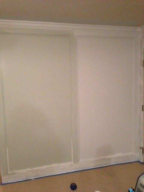
Tester colors

So, here's where I reveal that I am completely human and not in any way perfect when it comes to choosing color. I made my father-in-law (FIL) give me a few testers. Four, to be exact. He painted them in nice healthy swatches on a wall and gave me time to make my carefully thought out selection. I asked friends. I asked my husband. I asked my mom. I asked my dog. I asked myself! And finally, I PICKED A COLOR. Benjamin Moore- Silver Gray. I was so excited to see it on the wall... it was going to be perfect and beautiful and make my life complete. Right?? Below is what I came home to. 

Wait... what? 

See that prominent glass of wine in the picture? (Love me some CB2, ya'll!!) I needed it. I walked into the house and my heart sank. The color is gorgeous, but I want this room to be a place where I welcome friends and family and I wanted the color to encourage them to sit, relax and take a load off. The first thing I thought when I walked into the room and saw this color was... nursery. Beautiful, but just not the message I wanted this room to send. 

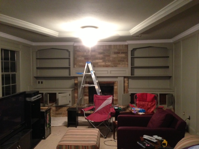
So, I cried, texted a confidant, asked her opinion, talked to my sweet husband, figured out a plan B, and picked a new color. This time, we went with a color called Rockport Gray. I saw it on the color chart and said to myself, "This is the color. You will like it. It will be THE color you wished for." 

I told my FIL and he, of course, made my second dream a reality. As a result, this is what we ended up with. This is an iphone picture that does not do the color justice... to me it looks like army green in this picture. In reality, it is a rich color that makes you just stop a little when you walk into the room. I've gotten several questions asking: "Is it gray? Is it sage? What color IS it?"

Let's keep it real- this was two months after being in the house! 

To give you a more realistic idea, this is the color from the Benjamin Moore website.


The beauty of paint is that it really does look very different under different lighting. This color changes personality with the time of day and with the amount of lighting placed on it. It has this quality of making you feel a bit enveloped in it- calm and serene during the day and warm and inviting at night. 

In the interest of keeping it real, I'll be showing you in-progress pictures as we go- none of our rooms are fully complete with decor and accessories and I want you to see the work in progress! So, there it is- our den as it stands. Till next time...

Cheers! 


Wednesday, July 10, 2013

Returning from a LONG hiatus... plus news that you've probably already heard!

Hi all,

Didya miss me? Didya, didya? Well, after taking a long, LONG time away (I'm not even sure where the time went... I look up and it's over a year later!), I'm back with some fun news that you may have already heard through c.d.b. design's facebook page, or just by knowing me personally. 

At the end of March of this year, the hubs and I bought a house! How fun! It is a 34 year old home that is gorgeous and perfect for us. The pups has a ton of room to roam around in the backyard and we have plenty of room to spread out and enjoy this new stage in our lives. We decided it was time to buy at what was actually a difficult time to buy- the lack of homes for sale in Texas made house shopping in our area a literal rat race to get a bid in on what felt like any and every house that was remotely decent and in our price range. My parents got a first-row seat to watch the emotional roller coaster that is house hunting, and my mom continued to insist that "Your perfect house is out there- just waiting for you to find it!". Well, I'll be darned if she wasn't exactly right! We stumbled upon a house that was a little more than we planned to spend, but had alot of the unique criteria that we were looking for. We contacted our Realtor, put a bid on the house and never looked back! 

The house is exactly what we were looking for- neither Jason or I particularly wanted a brand new home, but he was more open to the idea than I was. I have always dreamed of a house that had alot of its original character intact, but still had room for me to make it completely our own. So, without further ado, may I present to you- our new home! 


Wanna come over for dinner??

We closed at the end of March and moved in exactly two days later. This house is great enough that we could go ahead and move in and take our time with the projects that have planned to do. Total wood paneling throughout the den and bar? Paint it! Total wood paneling upstairs in the game room and second wet bar? Paint it too!! Questionable carpet in the dining room? Rip it up and give the floor new life! 

Of course, there are many, many projects that we simply don't have the time or money to fix right now, like (carpet in both upstairs bathrooms... huh?), replacing almost ALL of the siding, refinishing both bar counter tops, and replacing the not-as-questionable carpet in the den, so I'll be sharing with you the projects that we can afford to handle now and what we have planned for farther in the future. This is a slow and steady progression of making this house our home and I am so excited to share the journey with you!! 

Thanks for sticking with me, ya'll! See you soon! 

Cheers!
Catrina

Friday, May 4, 2012

Frame It!

Hi, friends! I hope that each of you are enjoying the arrival of Spring all around you. Here in Texas we are enjoying warmer (but not stifling!!) weather as well as bluebonnets and lots of Blue Bell ice cream! Yum!! 


So, moving on! Today I wanted to talk about one of my favorite decorating items- frames!! If you're custom framing your most cherished Van Gogh (ahem, for me, it would be a Van Gogh print... let's be honest...) or putting your favorite pictures of your puppy and best friends on your dresser, frames are everywhere! They are a perfect way to express what is important to you, regardless of what that is. No matter where you look, there are tons and tons of options for frames, and so many that can suit you however you like!


Before I jump into pictures, I just want to put a quick plug in for one of my favorite places to shop for frames- Hobby Lobby! Now, they don't know me from Adam (and that's ok!!), but in my humble opinion, they have a great selection of frames and tend to have them on a 50% off sale CONSTANTLY. My guess is probably every other week or so?? ALSO, they offer 40% off coupons on a regular basis, so now you have even more incentive to get the huge frame you've been eyeing and fill that sucker! I realize some of you may not have a Hobby Lobby close by, so if that's the case, come visit me and we can go on an all-day trip! Kidding... but I'm sure that there are lots of craft stores out there that can also give you a great selection of frames for a great price. Their website is not fabulous, but their stores sure are! Check it out if you haven't yet!!


Ok, back to frames. So, the reason I am in love with frames is that the possibilities for a great decor option is endless. You can get them in any size and color and put them practically anywhere! Maybe not your ceiling, but you know, your home is your home! ;)


SÖNDRUM Frame IKEA The mat enhances the picture and makes framing easy. PH-neutral mat; will not discolor the picture.
photo credit: ikea
This frame is a perfect example! It is $3.99 at Ikea and would be perfect as an accessory to shabby-chic decor like the picture below from Coastal Living Magazine.


photo credit: Coastal Living Magazine


Or, if you prefer a more modern, colorful look, the exact same photo frame could go well in this room:


Colorful living room
photo credit: www.ivstatic.com
Just add this color to your frame, and you've got a perfect pop and a great place to share your favorite memories!


Benjamin Moore- Scandinavian Blue


I also love this frame from Ikea- only $4.99!! This frame can be hung or stand alone, and if you don't like it in white, a quick layer or two of paint, and it's red! Or black! Or, blue! Whatever color you want it to be, it can be! 

KVILL Frame IKEA Can be used hanging or standing, both horizontally and vertically, to fit in the space available.
photo credit: ikea


 The rule of thumb is that you typically should hang frames in odd numbers and should either hang a painting alone or in groupings of no less than three. I tend to go with what looks best, and if that is 20 frames, hang 20 frames! If it's one piece that you love and that speaks to you, hang it by itself! Here is a perfect example of what 20 frames hung together would look like, just in case you are leaning towards a large grouping and aren't sure if you should go for it. 

Robin's egg blue
photo credit: elle decor
So, if you think that this is all fine and good but happen to have lots of pictures and frames that are NOT the same size, don't fret! The picture below from younghouselove.com is a perfect idea of how you can display photos that are important to you in a coordinated way. If your pictures and frames are not the same size or type, the best rule of thumb is to coordinate by color of the frame, mat and color picture. This way you have details that give the display some commonality without being too matchy-matchy. 

photo credit: younghouselove.com
I also wanted to share with you a picture of some frames that I have had with me since I started my first full-time job about 5 years ago. These pictures are from Target and came in two sets of two pictures. I originally bought the first set and ended up with extra wall-space in my office after a year or so. So, I went back to see if they had another set, which happened to coordinate perfectly with what I already had. I have a fear of things being too matchy-matchy in my personal decorating style, so the matching sets are hung diagonally from each other, just to mix it up a bit. These frames have been with me for years and are consistently one of my favorite wall-hanging projects of all time.

 Please excuse the reflection of my office lights! They don't turn off at all, ever. 


Thanks for stopping by, friends! Hope this has inspired you to add your personality to your favorite room through framed pictures. Happy decorating!!


Cheers,
Catrina 

Friday, April 6, 2012

Hoppy Easter!

Hi, friends! Didya like that title? "Hoppy" Easter? Like the bunny? Oh... I was the only one who got it? ;)  


Anyway, happy Easter weekend!! This is one of my very favorite holidays, as it speaks so well to the spirit of redemption that comes along with the crucifixion, burial and resurrection of Jesus. This holiday also just screams SPRING to me, with all of the fun colors, CANDY (who doesn't love candy??), Easter Egg hunts, good food and time with family! There are so many fun ways to celebrate Easter, from a bright, colorful celebration that is family-friendly and comfortable, to a more upscale celebration that has subdued colors but is high on style. 


Some of the things that are so essential to me in Easter decor are eggs, (of course!), flowers, candles and a great centerpiece. So, let's get started! Like I mentioned previously, eggs are extremely popular during this holiday, and there are so many ways you can use them to decorate for Easter! 


You can use them to make an adorable, colorful centerpiece by tying them on branches like this Martha Stewart tree. You can make this into a great DIY project by purchasing some floral foam at your local craft store, picking up branches either in your store, OR for free in your back yard, decorating some eggs, and tying them to the branches to make a high-reward, low effort centerpiece that looks fabulous and won't be high on your stress radar.  


photo credit: marthastewart.com
These filler eggs from Pottery Barn are perfect from hanging from your DIY tree, because they come with hooks that make them easy to hang. People will be talking about your brilliant arrangement for months to come!! 

Happy Easter Vase Filler, Set of 11
photo credit: Pottery Barn


I also love this Ceramic Egg Tower at Williams Sonoma for a concise, stunning centerpiece that is even easier than the DIY tree. Two of these on a table filled with colorful eggs can make a striking statement! 
photo credit: Williams-Sonoma

Another great option is this French Wire Egg Basket that would be equally as simple and equally as striking for an Easter centerpiece. The wonderful thing about this basket is that even though it is intended for eggs, you can do so much with it throughout the year!
photo credit: Williams-Sonoma

How cute would these eggs be in the above basket? I see a beautiful centerpiece coming together before our very eyes... :)  

Decorative Speckled Egg Vase Filler
photo credit: Pottery Barn

If you aren't really into the decorating with eggs idea, you can always do a floral arrangement, or combine the two! My all-time favorite flower is the peony, which is so delicate and beautiful and is very popular in the spring due to its not blooming very often during the year. Here are a few ideas for floral decor around the house. 

This is a beautiful tulip arrangement that I found at this etsy shop:  http://www.etsy.com/listing/71470959/yellow-tulips-spring-tulips-door  

photo credit: twoinspireyou- etsy shop
This particular arrangement is a door hanging, but it is still so beautiful and perfect for Easter! 

Here are a few more beautiful arrangements that use peonies. How sweet are these? 


photo credit: Blumenhaus Florist


photo credit: Bridgewater Gardens


If you want a little color in your arrangement, here's an perfect example of a peony arrangement that is striking and simple. The best part about these? They will NEVER die!! Ah, I love it! 

This arrangement is also available for purchase through etsy. Here's the website! 

photo credit: Sky Design USA- etsy shop
In closing, I absolutely must show you my most favorite Easter arrangement I have seen thus far! I saw this image in an email from Crate and Barrel and while I am normally a HUGE fan of color, this all-white arrangement is simply stunning. I am in LOVE with it!! I hope that it inspires you to create a beautiful space for you and your family! 

photo credit: Crate & Barrel

I hope that this post has given you some good ideas of amazing decorating options you can do that will be not only budget friendly, but easy to do! I also hope that each of you has a wonderful Easter filled with family, friends and many warm memories made. Happy Easter, and happy decorating!! 

Cheers!
Catrina 


Sunday, March 25, 2012

The D Family

Hi, friends!! 


I hope you guys have had a great start to sunny Springtime! It has been a very busy month on my end, and I've missed sharing fun design tidbits with you all! 


This past week I had a great opportunity to work with a wonderful family- the D Family! They are a very trendy family with great taste and Louiza has a great talent for integrating a beautiful home with functionality for being a mom to two twin boys!! Louiza was looking for help with organizing a few areas of her living room, as well as providing a fresh transition from her grown-up living room to her boys' FUN, kid-friendly play area. 


The D family recently invested in some beautiful custom shelving work in their home and wanted to integrate some beautiful show pieces with the functionality of providing a safe place for her boys to enjoy. The pictures below showcase our updated solution to her design concerns and show off a fun play-room in the background!


Note the pops of color throughout the photos-  you'll see them alot in this post!
Up-close detail. Don't you love the figurines of the twins? So cute!

Shelves on the left side of the room. How much do you love that gorgeous crystal bowl?

Close-up shot of a beautiful piece!

In an effort to make the shelves attractive AND functional, we put some of the twins' books and toys on the bottom shelves, which turned out wonderfully! 


Here's a shot of the two shelves that provide just enough access for young hands to reach! 

Louiza has had some beautiful decor items given to her over the course of her career and many of them resulted in gorgeous accent pieces in her living room! 

Doesn't this shot just make you want to pack your bags at hop on a plane?

I have to brag on Louiza for a second- she had ALL of these beautiful items in her living room already AND had previously styled her decor in a similar way! Amazing!!

The accent plate and the amazing vase in this picture were previously on the shelves shown in the first pictures. A quick switch brought a balance of color to the entire room. 

P.S. Is anyone else IN LOVE with the vase in this picture? Surely I'm not the only one! 

So, here's the low-down on the beautiful D Home!! Louiza, thank you SO MUCH for such a fun evening and for the chance to work with you in your living room! I had a wonderful time with you and look forward to working together again soon!! 

Thanks for checking in, you guys! Hope you enjoyed my latest project and as always, happy decorating!!

Cheers!
Catrina


Friday, February 24, 2012

Friday Favorite! Ok, ok...Saturday Favorite!

Hi, friends!! Happy Friday! Or, if you're anywhere in the Houston area, Happy Go Texan Day!! ;) I *tried* to make my look a little Western today, but I'm not sure how well I did. I just know I used to LOVE dressing up in "Go Texan" gear in elementary school!! Not sure I can say the same about my enthusiasm level as an adult...


Ahhh, but I digress!


So, today, I wanted to touch on something that is so basic, so fundamental in decor that I can guarantee that each of you reading this post has some sort of story relating to this. Today I want to talk about... paint!!! It is something that we all have dealt with, from the institutional-white colors of our dorm rooms to the crazy paint colors we wanted in our bedrooms as children, all the way to the funky colors you have throughout your home right this very second!


I think that many people choose to go with a safe color in the white/cream/beige/khaki family just to make sure that you don't end up with something horrific that you will hate forever and feel stuck with. This is completely reasonable, but I want to encourage you to be brave and step out of the box every now and then!!


Let's do a small, teensy test. Quick- think of a color, any color. Do you have one? Ok, now look around your home and see if the color you thought of is anywhere around your home. I'm willing to bet that in some capacity, it is. It may be in a throw pillow, or a rug, or a comforter, lamp, or shower curtain. Now here comes the crazy part: have you thought of painting a wall in your house that color, or a variant of that color? What about painting a piece of furniture? I know, I'm getting crazy over here.


To help you with getting over your hesitation, I'm going to give a personal example and show you some fun, creative ways that color can be used in your home to make a dramatic, beautiful impact. For me personally, the color I keep going to over and over is... of all colors... black!! I LOVE black, you guys! If you have ever been in my home at any given time, you'll notice there is lots of black everywhere. I haven't had the opportunity to paint a wall that color yet, so I don't have any personal pictures to show you, but trust me... this is going to be inspiration for the future! I proceed to showing you exhibit one:


photo credit: House Beautiful


The paint color used in this picture is Benjamin Moore- Black Satin. I think it is absolutely stunning!! So sexy and so fun!


Exhibit two:


photo credit: House Beautiful


Note that there is tons of natural light in both rooms. This a must, and a south-facing room is best for any dark color like navy, chocolate, eggplant or black. If you don't have a south-facing room but still want to paint a dark color, try to ensure that the room has as MUCH sunlight as possible to lighten the room. We don't necessarily want to channel Cruella DeVille here...


photo credit: c.d.b. design


Here is a beautiful example of chocolate in a room as well. I did not pick out this paint color, but it was in a clients' home and was absolutely stunning. For the ceiling height and room size, the paint color makes the room feel so very warm and inviting.


Ok, let's move on to some brighter, more fun colors. Another color I hear mentioned often is yellow. Yellow is certainly making a huge comeback this season and can be beautiful if done correctly.


This is a bright, fun yellow that would be great in a hallway or a child's room. This paint is by Pittsburgh Paints and is called Forsythia Blossom.


photo credit: House Beautiful


If you love yellow but don't want the brightness, try something a bit more muted. I tend to call this shade of yellow "butter", but this picture refers to it as a cream. I can imagine this color in a bedroom or living room, and what a calming effect it would have!!! So warm and inviting!!


photo credit: House Beautiful


Another color people tend to love but shy away from is red. There are so many variations of red that you can use to suit your exact decor desire.


photo credit: House Beautiful


This red is called Blazer 212 by Farrow & Ball. LOVE red but nervous about committing to a whole room?
Paint a piece of furniture! This shot is classic and exciting at the same time because of the color use.


photo credit: House Beautiful


The red used in this photo is Heritage Red by Benjamin Moore.


Ok, for just a few more tidbits of encouragement, I want to leave you with just a few more ideas of paint colors you can use throughout your home. 


Now, I know, if you were a client of mine and I told you to think about... say... a hot PINK color in your house, you'd think I was crazy right?? Well... not so fast! If you are in the stage of life where you can make a fun color choice in your home, why not? I think this may do a bit of work to convince you...


photo credit: House Beautiful


Cute, right?? What a jolt of energy before you even get to your morning coffee! This paint color is so very appropriately named Razzle Dazzle by Benjamin Moore. 


Another great idea is to paint not the walls, but the ceiling of a room to provide a fun pop of color to a unique space. 

photo credit: House Beautiful


Beautiful, no? I normally RUN away from a soft, powder pink, but I think that the presence of pink in this room is so romantic and is just right. 


Here's another fun color that is appropriately toned down by a great print and classic colors. Can you imagine yourself buying paint in a punchy lime?


photo credit: House Beautiful


For a softer green, why not try something a little closer to mint? This option can be a serene, calming color choice while being chic and completely up to date. Check out the nursery I consulted on for Baby Rebekah! 


photo credit: c.d.b. design


Are you inspired yet?? I sure hope so!!! Just a tip for those of you that are ready to take the COLOR plunge: paint a poster-board size block of color in the room you are thinking of changing. Or, go even bigger and do a 6x6 ft. color swatch and let it sit for a few days. If you are in love, take the plunge!! If you hate it, there is no commitment and less work to change it to a neutral color, or back to what you originally had. 


Best of luck, and happy painting!! I hope you are inspired to create a beautiful space this week!! Have a wonderful weekend!! 


Cheers! 
Catrina