Friday, February 24, 2012

Friday Favorite! Ok, ok...Saturday Favorite!

Hi, friends!! Happy Friday! Or, if you're anywhere in the Houston area, Happy Go Texan Day!! ;) I *tried* to make my look a little Western today, but I'm not sure how well I did. I just know I used to LOVE dressing up in "Go Texan" gear in elementary school!! Not sure I can say the same about my enthusiasm level as an adult...


Ahhh, but I digress!


So, today, I wanted to touch on something that is so basic, so fundamental in decor that I can guarantee that each of you reading this post has some sort of story relating to this. Today I want to talk about... paint!!! It is something that we all have dealt with, from the institutional-white colors of our dorm rooms to the crazy paint colors we wanted in our bedrooms as children, all the way to the funky colors you have throughout your home right this very second!


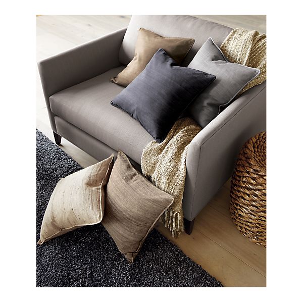
I think that many people choose to go with a safe color in the white/cream/beige/khaki family just to make sure that you don't end up with something horrific that you will hate forever and feel stuck with. This is completely reasonable, but I want to encourage you to be brave and step out of the box every now and then!!


Let's do a small, teensy test. Quick- think of a color, any color. Do you have one? Ok, now look around your home and see if the color you thought of is anywhere around your home. I'm willing to bet that in some capacity, it is. It may be in a throw pillow, or a rug, or a comforter, lamp, or shower curtain. Now here comes the crazy part: have you thought of painting a wall in your house that color, or a variant of that color? What about painting a piece of furniture? I know, I'm getting crazy over here.


To help you with getting over your hesitation, I'm going to give a personal example and show you some fun, creative ways that color can be used in your home to make a dramatic, beautiful impact. For me personally, the color I keep going to over and over is... of all colors... black!! I LOVE black, you guys! If you have ever been in my home at any given time, you'll notice there is lots of black everywhere. I haven't had the opportunity to paint a wall that color yet, so I don't have any personal pictures to show you, but trust me... this is going to be inspiration for the future! I proceed to showing you exhibit one:


photo credit: House Beautiful


The paint color used in this picture is Benjamin Moore- Black Satin. I think it is absolutely stunning!! So sexy and so fun!


Exhibit two:


photo credit: House Beautiful


Note that there is tons of natural light in both rooms. This a must, and a south-facing room is best for any dark color like navy, chocolate, eggplant or black. If you don't have a south-facing room but still want to paint a dark color, try to ensure that the room has as MUCH sunlight as possible to lighten the room. We don't necessarily want to channel Cruella DeVille here...


photo credit: c.d.b. design


Here is a beautiful example of chocolate in a room as well. I did not pick out this paint color, but it was in a clients' home and was absolutely stunning. For the ceiling height and room size, the paint color makes the room feel so very warm and inviting.


Ok, let's move on to some brighter, more fun colors. Another color I hear mentioned often is yellow. Yellow is certainly making a huge comeback this season and can be beautiful if done correctly.


This is a bright, fun yellow that would be great in a hallway or a child's room. This paint is by Pittsburgh Paints and is called Forsythia Blossom.


photo credit: House Beautiful


If you love yellow but don't want the brightness, try something a bit more muted. I tend to call this shade of yellow "butter", but this picture refers to it as a cream. I can imagine this color in a bedroom or living room, and what a calming effect it would have!!! So warm and inviting!!


photo credit: House Beautiful


Another color people tend to love but shy away from is red. There are so many variations of red that you can use to suit your exact decor desire.


photo credit: House Beautiful


This red is called Blazer 212 by Farrow & Ball. LOVE red but nervous about committing to a whole room?
Paint a piece of furniture! This shot is classic and exciting at the same time because of the color use.


photo credit: House Beautiful


The red used in this photo is Heritage Red by Benjamin Moore.


Ok, for just a few more tidbits of encouragement, I want to leave you with just a few more ideas of paint colors you can use throughout your home. 


Now, I know, if you were a client of mine and I told you to think about... say... a hot PINK color in your house, you'd think I was crazy right?? Well... not so fast! If you are in the stage of life where you can make a fun color choice in your home, why not? I think this may do a bit of work to convince you...


photo credit: House Beautiful


Cute, right?? What a jolt of energy before you even get to your morning coffee! This paint color is so very appropriately named Razzle Dazzle by Benjamin Moore. 


Another great idea is to paint not the walls, but the ceiling of a room to provide a fun pop of color to a unique space. 

photo credit: House Beautiful


Beautiful, no? I normally RUN away from a soft, powder pink, but I think that the presence of pink in this room is so romantic and is just right. 


Here's another fun color that is appropriately toned down by a great print and classic colors. Can you imagine yourself buying paint in a punchy lime?


photo credit: House Beautiful


For a softer green, why not try something a little closer to mint? This option can be a serene, calming color choice while being chic and completely up to date. Check out the nursery I consulted on for Baby Rebekah! 


photo credit: c.d.b. design


Are you inspired yet?? I sure hope so!!! Just a tip for those of you that are ready to take the COLOR plunge: paint a poster-board size block of color in the room you are thinking of changing. Or, go even bigger and do a 6x6 ft. color swatch and let it sit for a few days. If you are in love, take the plunge!! If you hate it, there is no commitment and less work to change it to a neutral color, or back to what you originally had. 


Best of luck, and happy painting!! I hope you are inspired to create a beautiful space this week!! Have a wonderful weekend!! 


Cheers! 
Catrina

Friday, February 10, 2012

Friday Favorite!


Hi, friends!! Happy Friday!!


I hope that you all had a great week and that this Friday caps off a productive, happy week for each of you! 


In many of my conversations about decor, many friends and clients share that they want to change the look of a room in their home, but REALLY don't want to commit to changing a paint color or pay for new furniture. They want a new feel but just don't want to spend the time or effort to dramatically re-decorate a room to suit their new look. 


The good news is that there are so many different options that can deliver the change that you want with minimal effort! New curtains or a new rug can dramatically change the personality of a room in an instant. However, I want to touch on one of my FAVORITE decor items and our topic today, throw pillows!! There are SO many options out there for such wonderful prices that you simply can't go wrong. I know many people overlook throw pillows because they "don't serve a purpose", but in the decor world, they can! Also, there are so many patterns and styles out there that you can easily find pillows that are decorative but functional at the same time. So, without further adieu, here are some of my favorite combinations. 


Taffeta Dot Pillow

www.pier1.com


www.zgallerie.com

You can take something simple like a circle pattern and mix it with something a bit more complicated, but complimentary in the color category. 

Here's another example of mixing patterns- these are a bit more modern and I love the colors combination! Yellow & gray is so very in these days!

www.zgallerie.com


www.zgallerie.com


This is a perfect example of a neutral combination with a LOT of style! This Layla pillow from Crate & Barrel is so simple, but SO stunning!


LaylaPillow20inS12
www.crateandbarrel.com


www.crateandbarrel.com


This pillow would provide lots of substance while letting the cream show stopper take center stage! 


I'm not sure if you're like me at all, but I also like to see the finished product, or see HOW these looks play together. So, here's a few examples that show just HOW MUCH a few throw pillows can bring a room together! 


credit: Crate & Barrel


credit: House Beautiful 


*Notice how well the different patterns and colors play off of each other? Not something you would pick in the store, but they come together beautifully in this room!! 


Remember the Layla pillow from Crate & Barrel? Designer Melissa Warner used them in this room and they are gorgeous!! 


credit: House Beautiful


This final picture is a perfect example of how patterns can play off of each other to tie a room together, and how the right throw pillow can finish the job! Notice that on the left couch, a solid color is used, while on the right, cream couch a bold, complimentary pattern is used. 


credit: House Beautiful


Hope you guys enjoy!! Happy decorating, and here's to making beautiful spaces no matter where we are! See you next week! 


Cheers,

Catrina 

Friday, February 3, 2012

Friday Favorite!

Hi, friends! I hope this week was wonderful for each of you! I had a bit of a rough start to this week- I was sick on Monday and Tuesday and still don't quite seem to be at 100%. We've got a busy weekend ahead, so I'm hoping that I can get caught up on some rest and FAST!!


This week's Friday Favorite is a bit unexpected for me. I have always been a fan of using lighting to enhance a room's personality. In my humble opinion, choosing the right lighting can be just as important as choosing the right paint color or furniture to put in a room. It speaks volumes with regard to what message you want to convey with your space! Just think- a dimly lit bedroom can enhance the feelings of relaxation and comfort, while a well lit kitchen and entry-way can convey warmth and emphasize that area as a busy hub in your home!


So, my new latest obsession in the lighting world is hands down pendant lighting! It is fresh and simple, but can be so striking at the same time. I think that given how you use pendant lighting, it can convey so many different moods and enhance SO many different settings!! My favorite location for pendant lighting is in the kitchen and entry way, but I have seen them used in tons of different rooms in so many different ways! So, my favorites are actually almost all from Pottery Barn!! Of course, there are GORGEOUS ones at Restoration Hardware as well, but Pottery Barn has amazing options for much more attractive prices. However, if you can rock the Restoration Hardware, I say, more power to you! You've got excellent taste!


For example, if you're into the more industrial look of pendant lighting, check out this beauty. Or, if you like something a little more streamlined, I am in love with this piece


Ok, for my all time favorite- this is the Exter 5-Jar Pendant at Pottery Barn. Is this not to die for??


Pendant Lighting


Here is another one from Pottery Barn- I think this one is beautiful if you prefer softer lines and want something a little more feminine looking, but still in a pendant style. 


PB Pendant Lighting


This last example would be PERFECT in a study or library or in a general family area that doesn't necessarily need bright lighting. I love the simplicity of the lines mixed with the honeycomb design. 


PB Honeycomb Pendant


Ok, so there you have it!! Lots of examples of one of my latest favorite things- pendant lights! Hope you enjoy, and if you happen to stop by Pottery Barn this weekend, take a peek for me!! 


Hope your Superbowl weekend is splendid! Happy decorating!!


Cheers,
Catrina